UI/UX INTERNSHIP · OPPO
ColorOS 17
Core UI Design
COMPANY
oppo/ColorOS
DURATION
Sep 2025 - Jan 2026
TEAM
Common Components
ROLE
UI/UX Designer
01 OVERVIEW
A NEW SYSTEM DESIGN LANGUAGE
Embedded in OPPO's ColorOS 17 Common Components team, I helped define and ship a translucent, light - driven design language across foundational system components — shaping the visual and interaction foundation for the next major OS release.
Embedded in OPPO's ColorOS 17 Common Components team, I helped define and ship a translucent, light - driven design language across foundational system components — shaping the visual and interaction foundation for the next major OS release.
THE CHALLENGE
ColorOS 17 demanded a new visual paradigm: semi-transparent materials with depth, light physics, and layered elevation — all implementable at OS-level fidelity without sacrificing performance.
MY CONTRIBUTION
From early material exploration through to engineering spec handoff, I owned key components of the system — building frameworks, defining rules, and calibrating rendered builds to achieve pixel-accurate results.
SCOPE
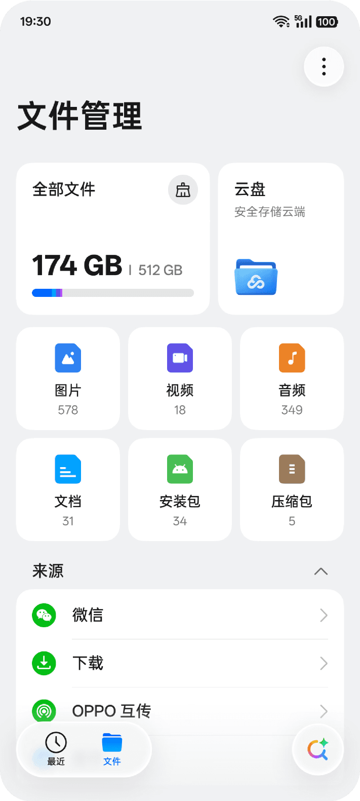
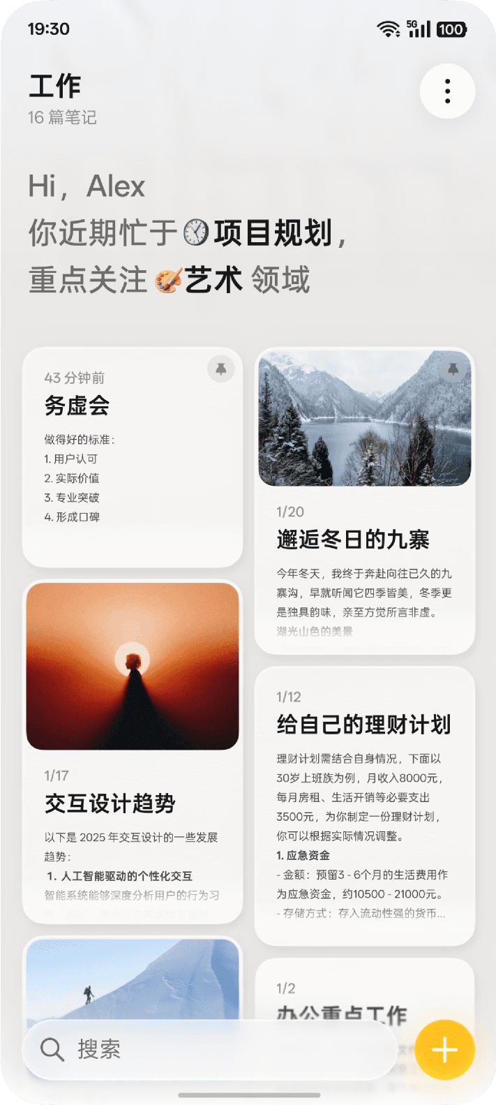
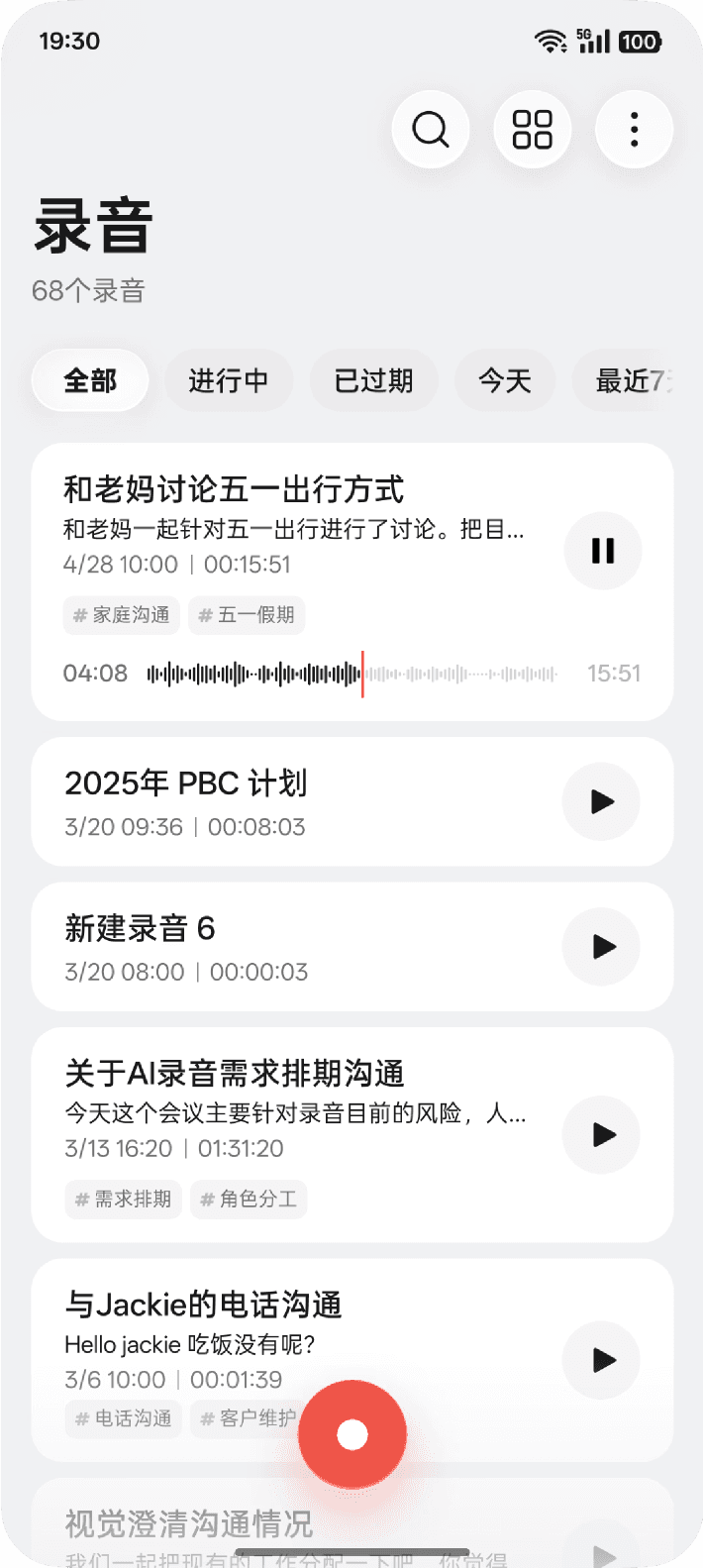
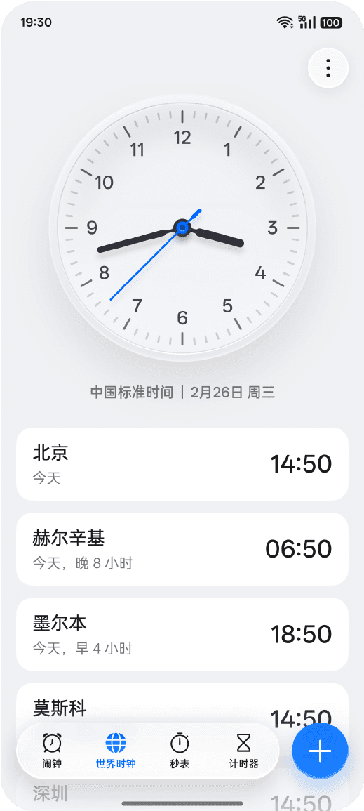
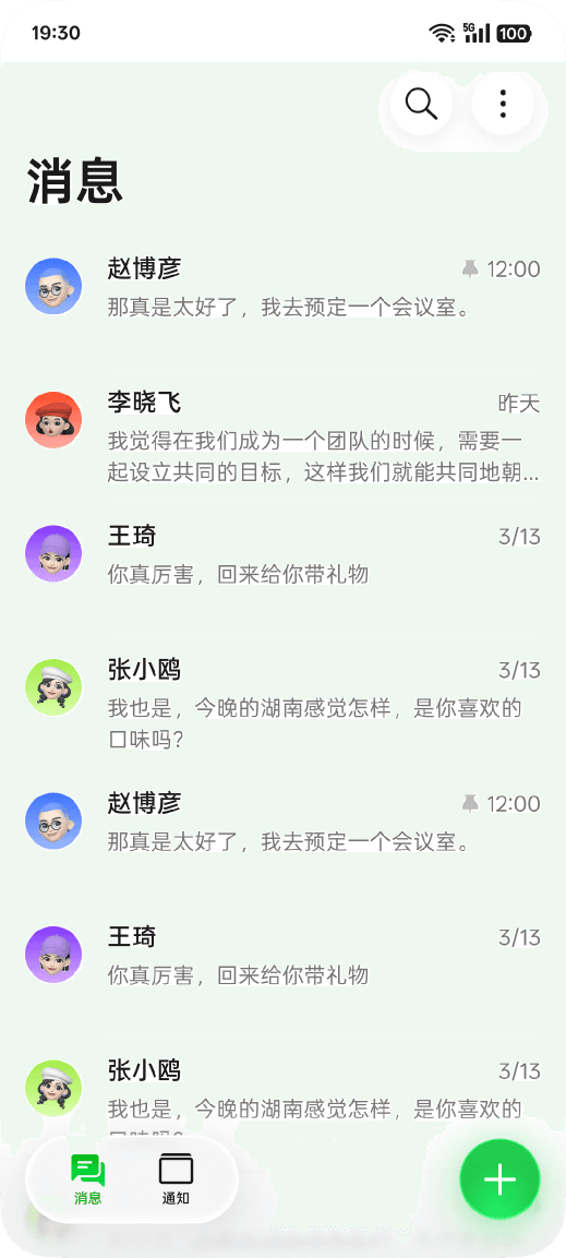
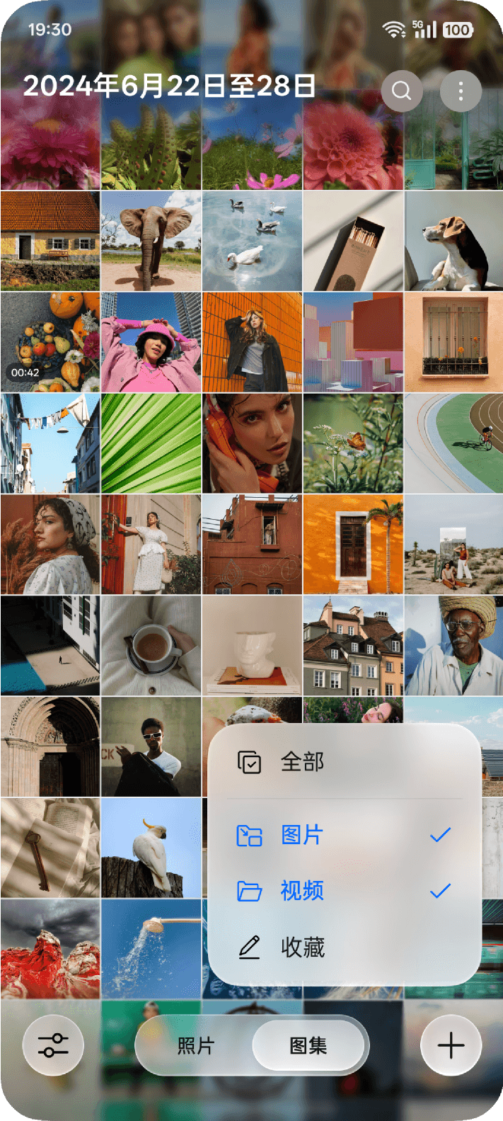
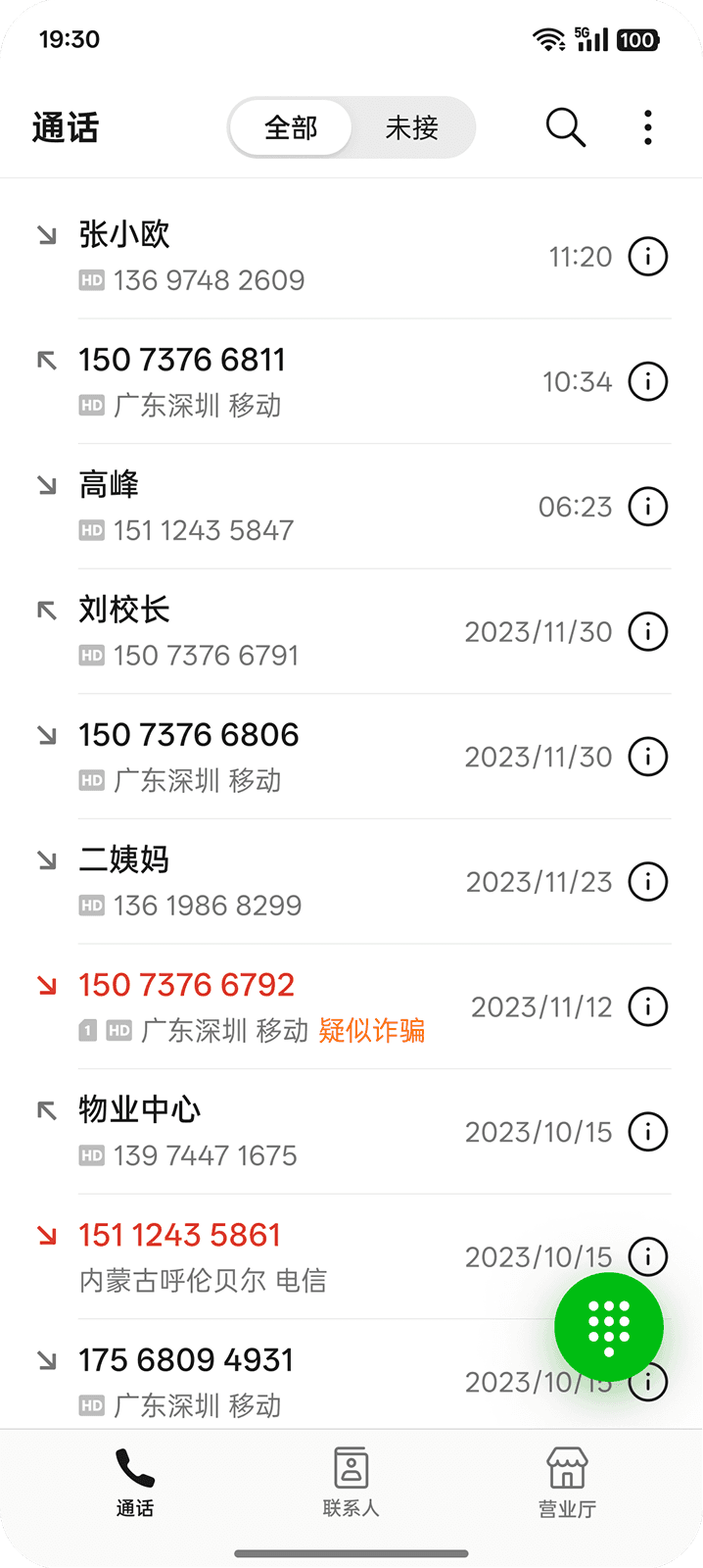
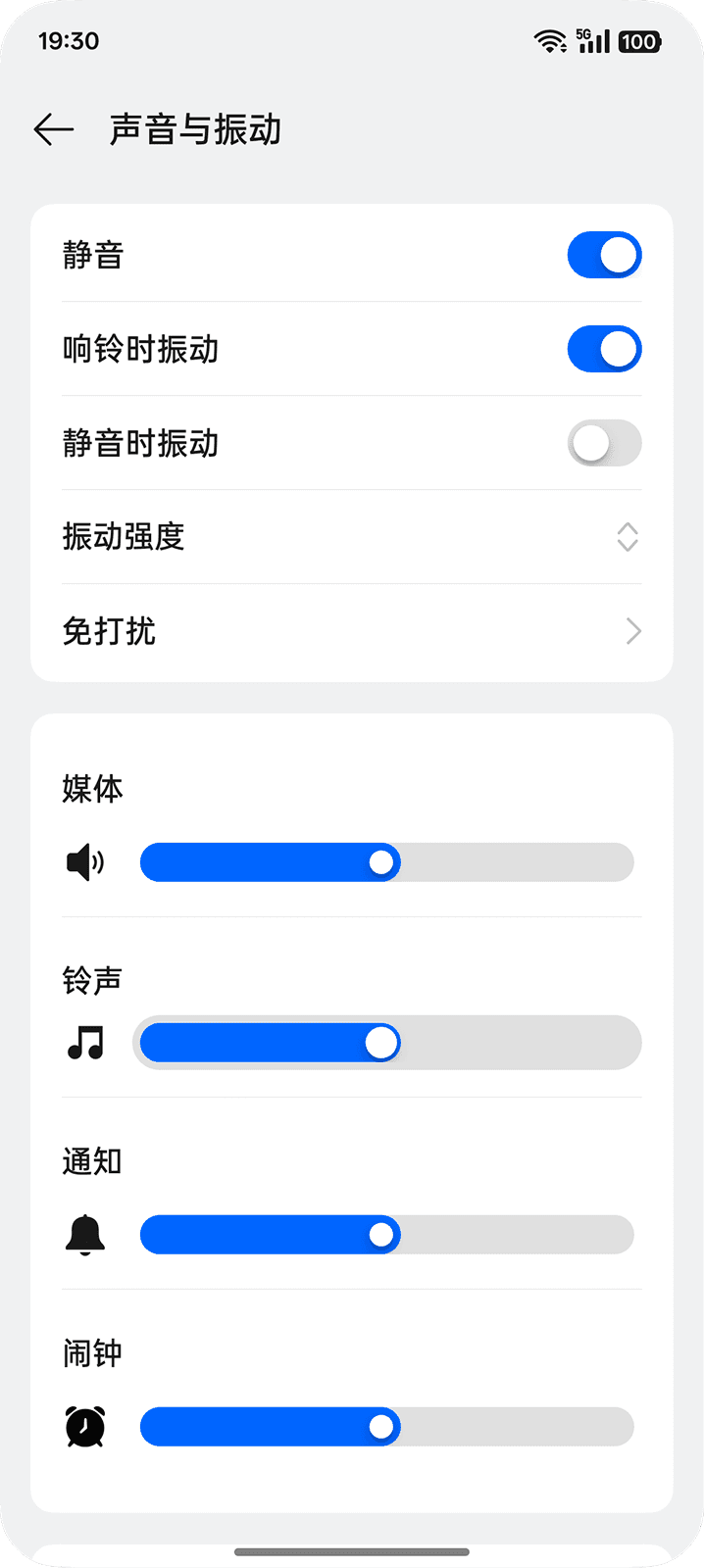
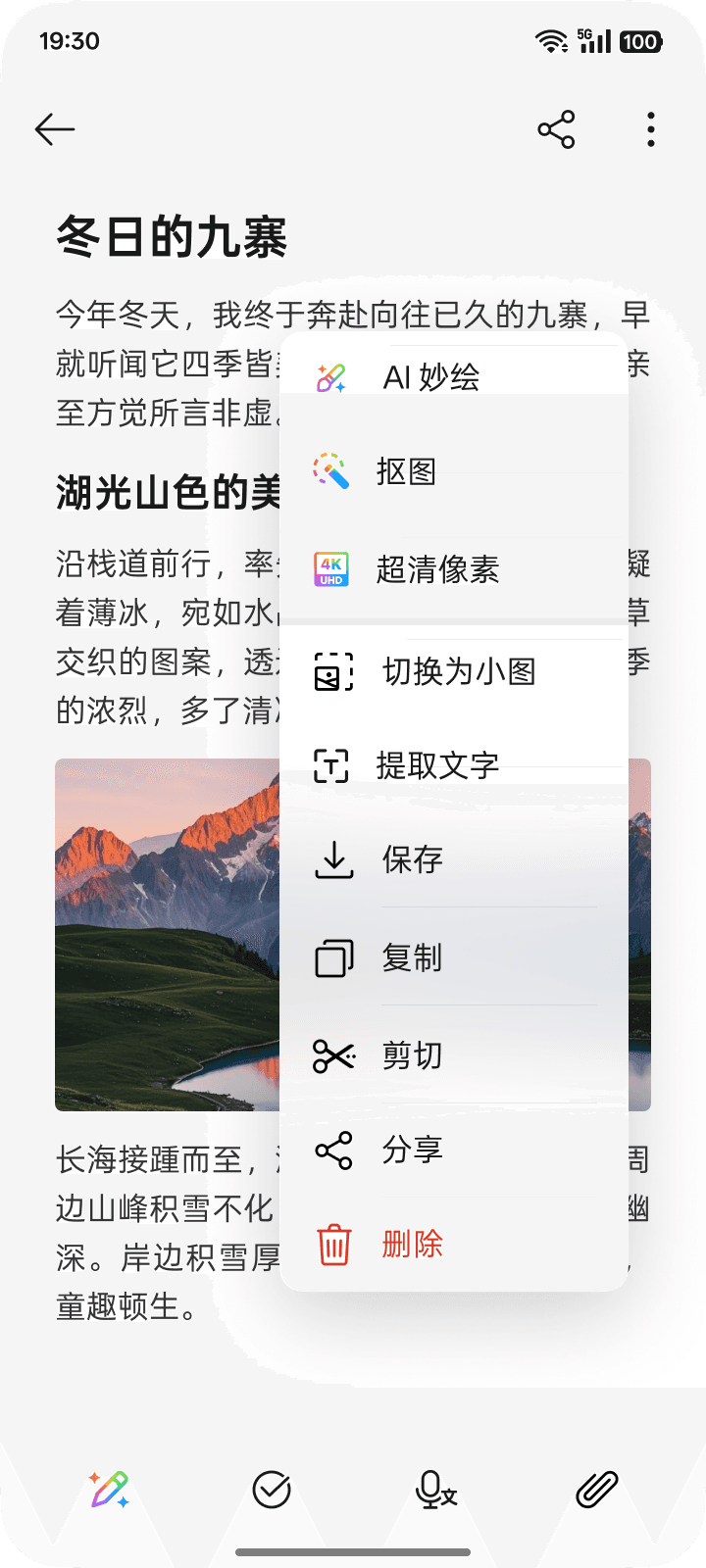
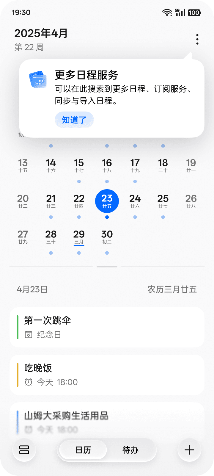
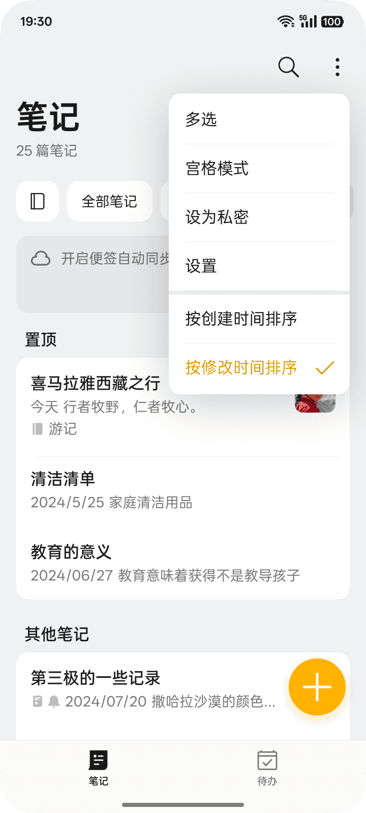
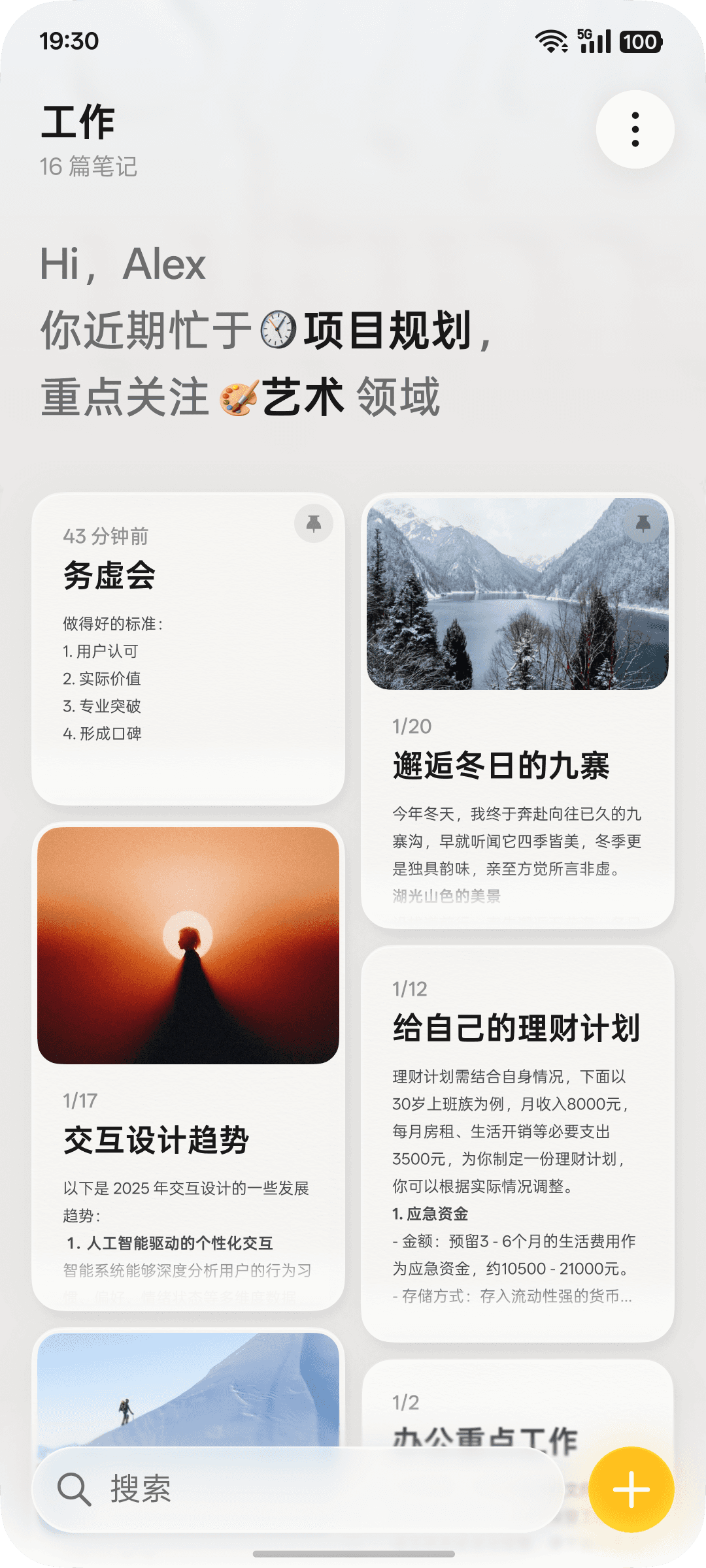
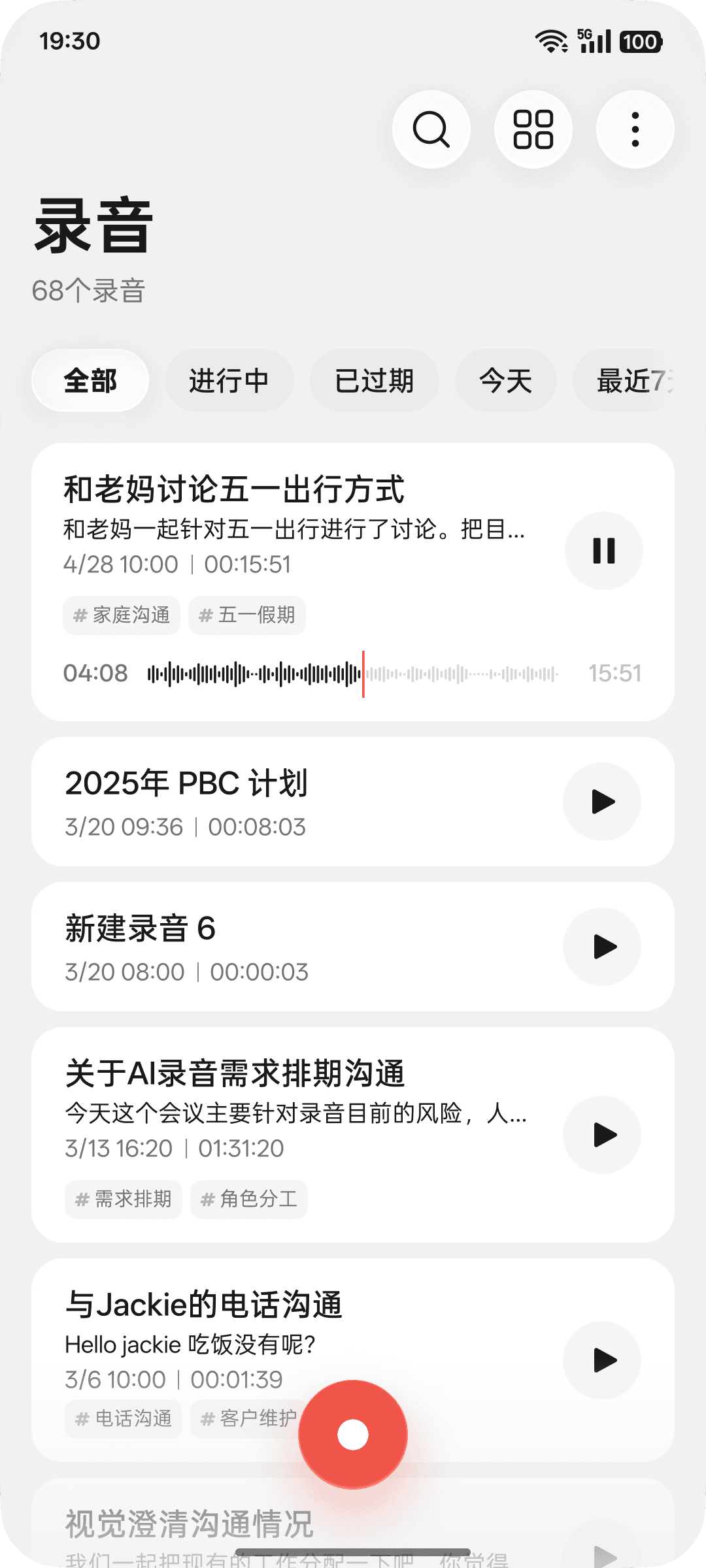
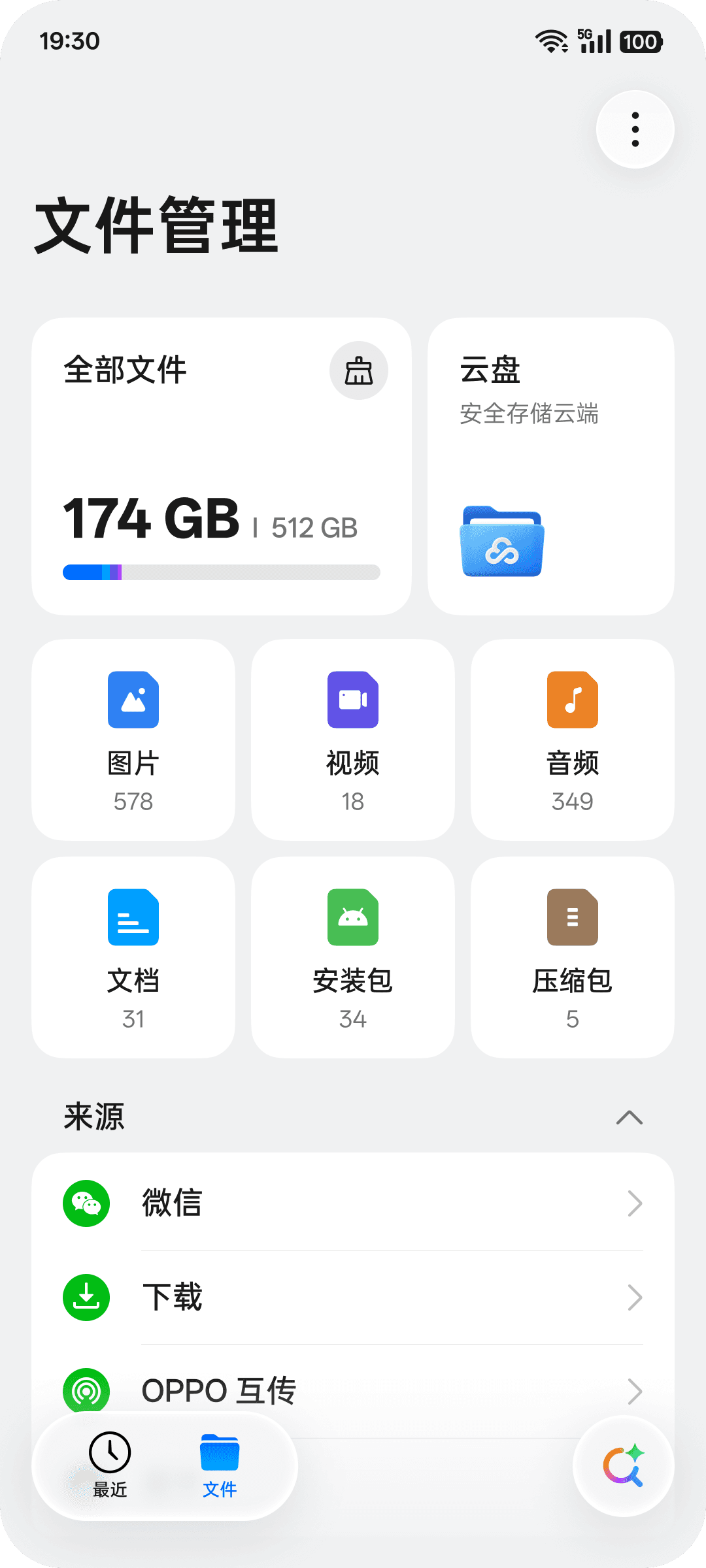
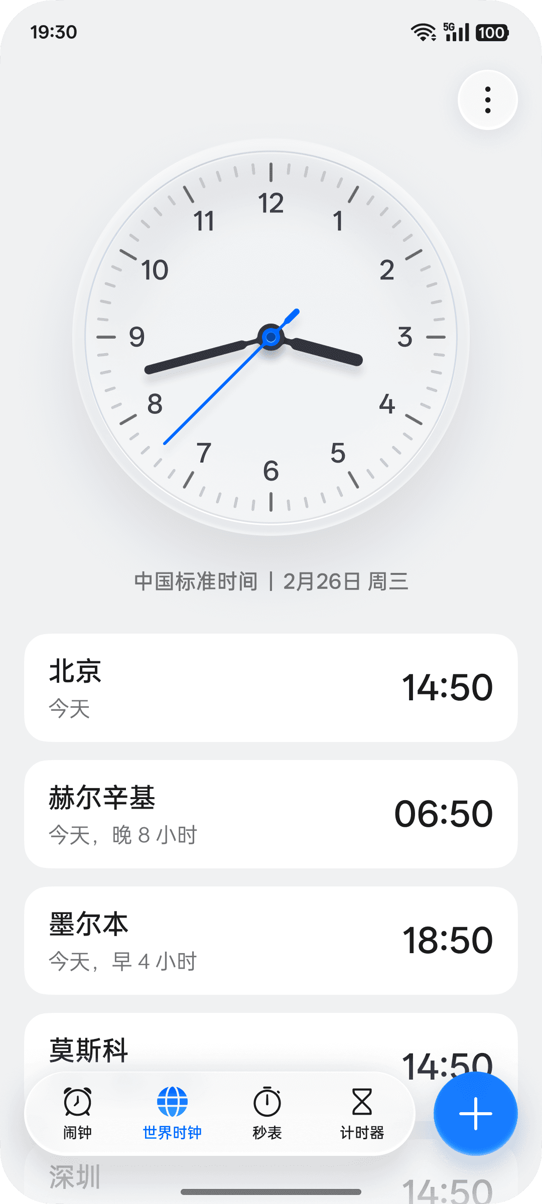
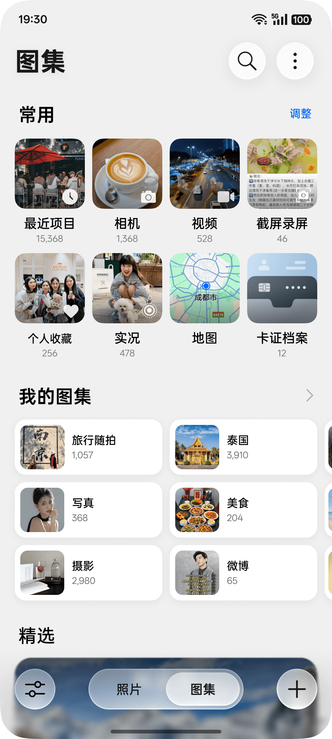
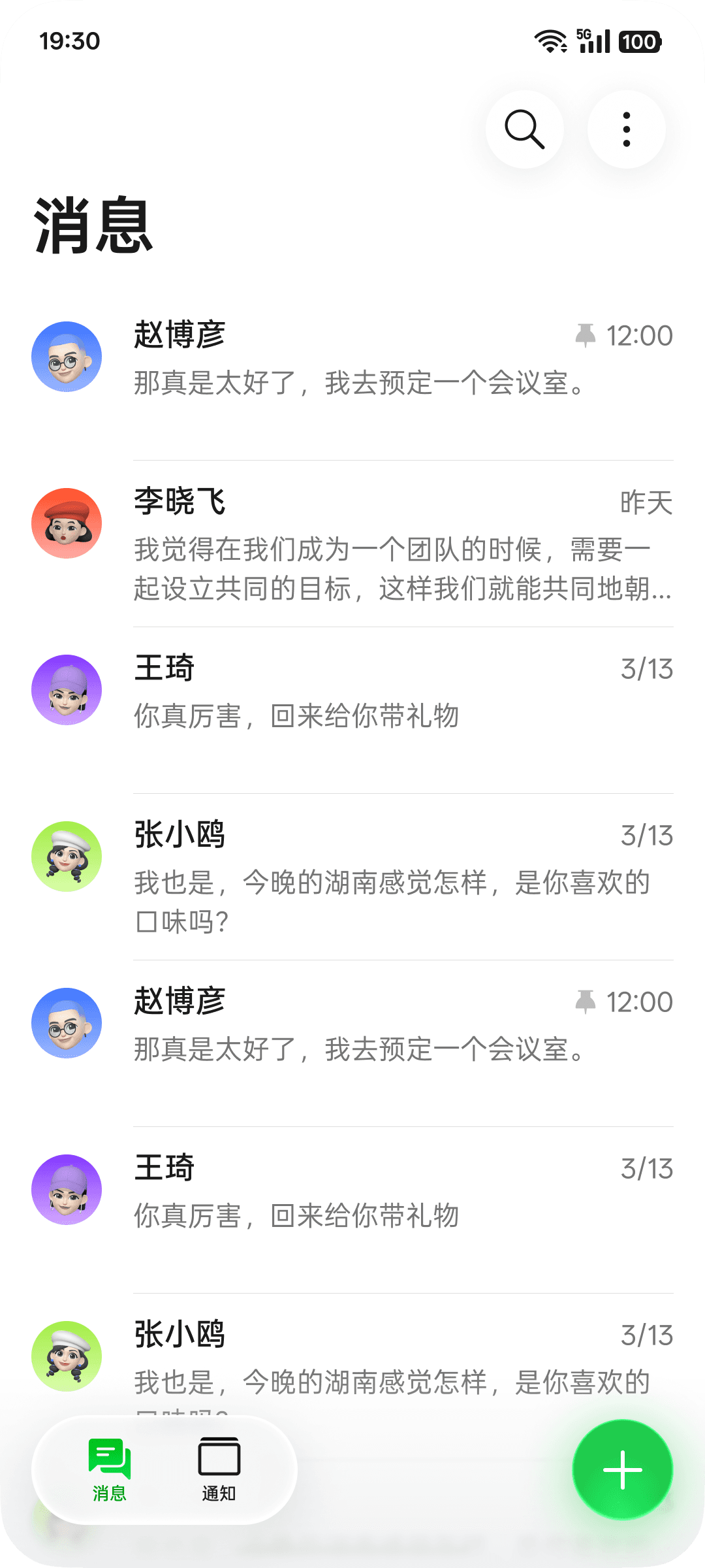
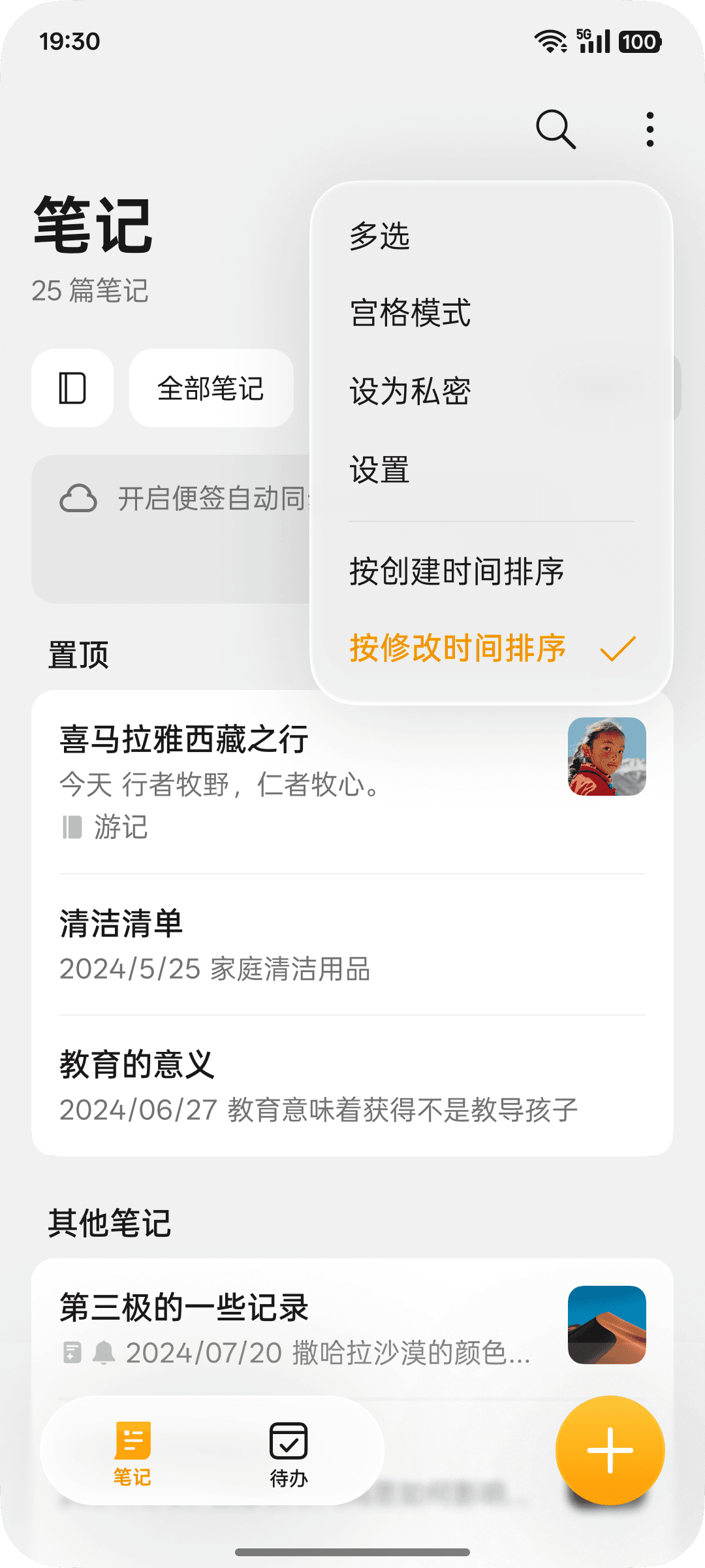
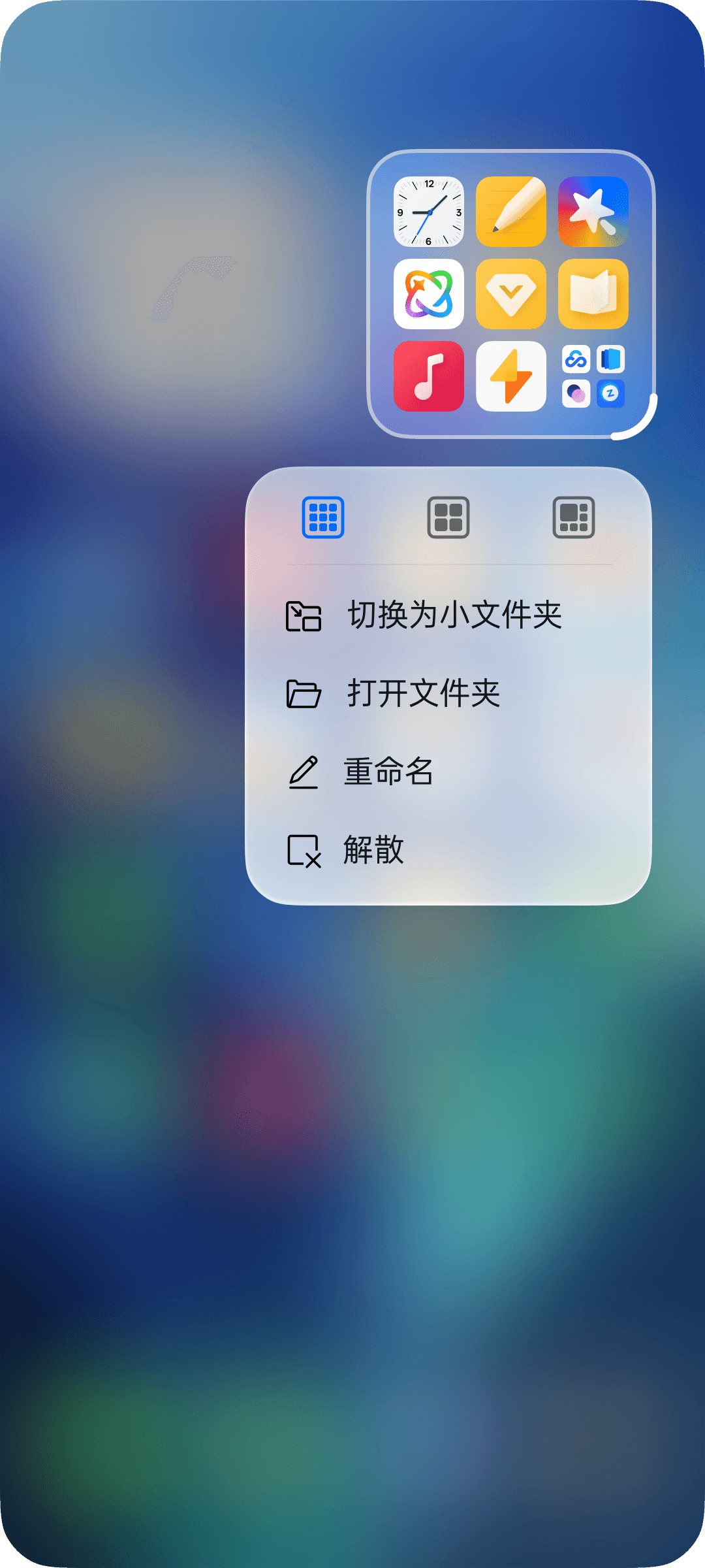
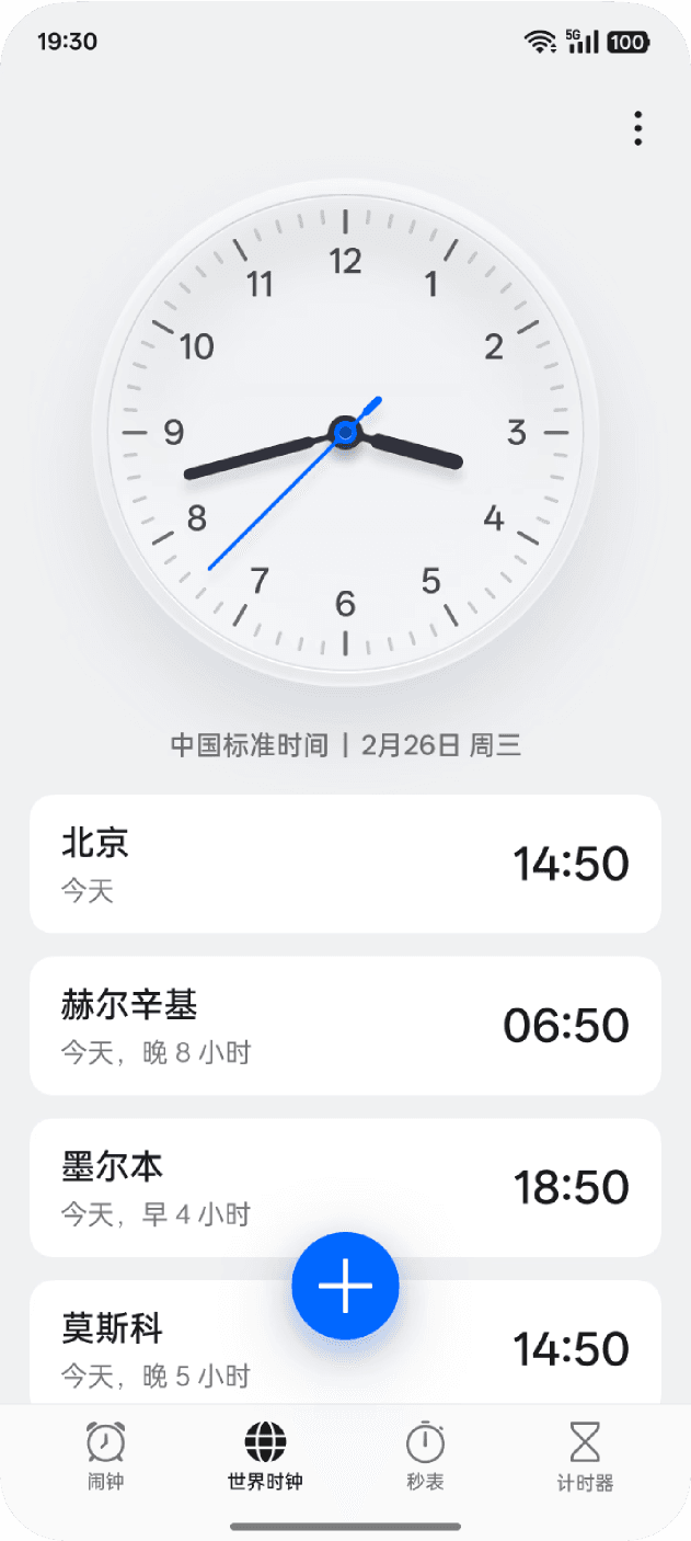
Navigation bars, tab bars, dialogs, title bars, quick actions, system elevation — the full stack of ColorOS 17 core common components.
02 ROLE & RESPONSIBILITIES
WHAT I OWNED
01
01
Visual Direction & Material Studies
Visual Direction & Material Studies
Early explorations into material behavior and light physics — studying how light-edge strokes, caustic-like bottom highlights, and diffused glow could define a coherent translucent language for the OS.
Early explorations into material behavior and light physics — studying how light-edge strokes, caustic-like bottom highlights, and diffused glow could define a coherent translucent language for the OS.
MATERIAL DESIGN
MATERIAL DESIGN
EXPLORATION
EXPLORATION
VISUAL DIRECTION
VISUAL DIRECTION
02
02
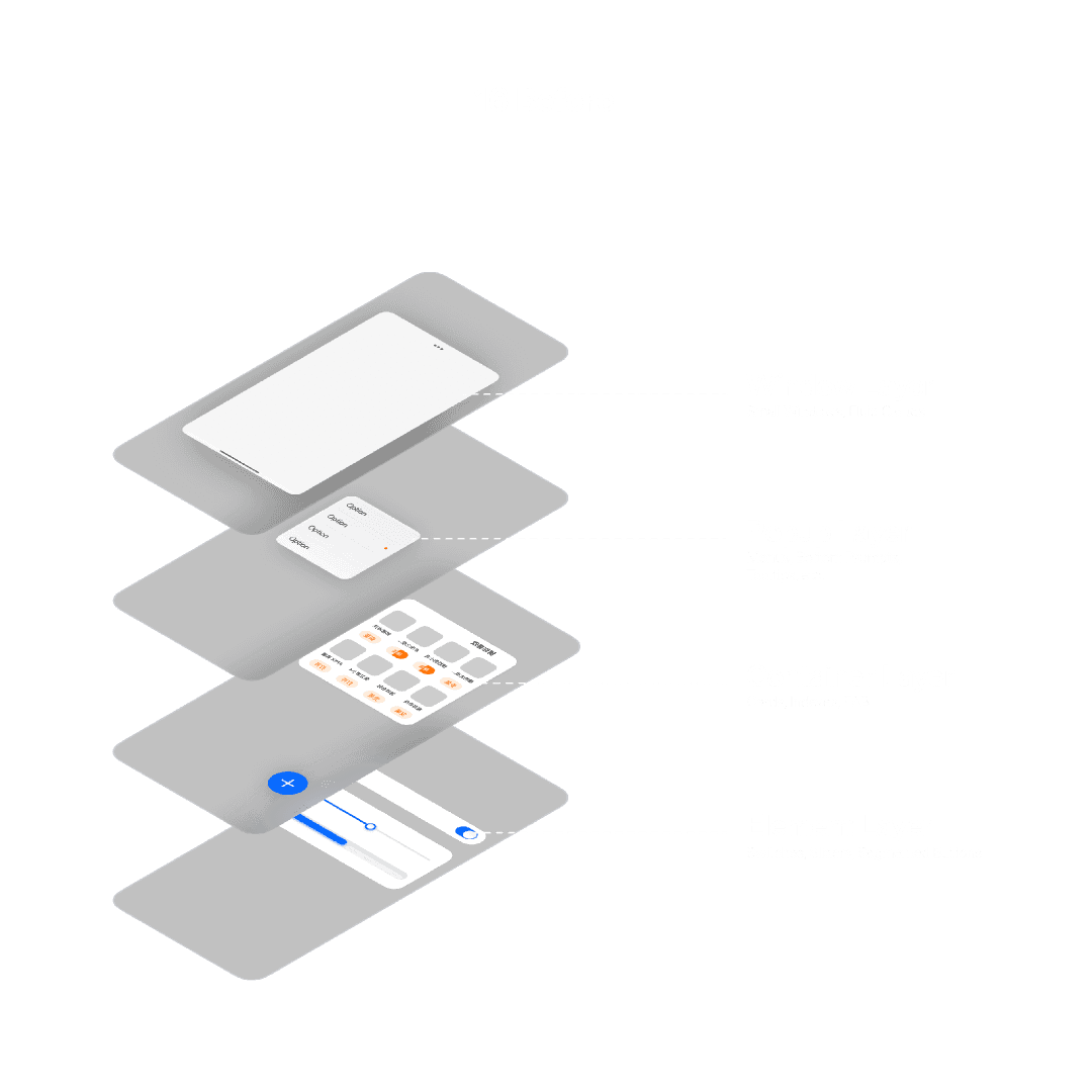
5-level shadow hierarchy system.
5-level shadow hierarchy system.
Defined and documented a structured 5-tier elevation and shadow system for semi-transparent UI — establishing consistent opacity, blur, stroke, and glow values per tier, enabling systematic application across all components.
Defined and documented a structured 5-tier elevation and shadow system for semi-transparent UI — establishing consistent opacity, blur, stroke, and glow values per tier, enabling systematic application across all components.
SYSTEMS DESIGN
SYSTEMS DESIGN
ELEVATION
ELEVATION
SHADOW
SHADOW
03
03
Interaction Design & Quick Actions
Interaction Design & Quick Actions
Redesigned interaction paradigms aligned with the new translucent paradigm — including press-and-hold Quick Action behaviors and comprehensive placement and reachability rules across device form factors.
Redesigned interaction paradigms aligned with the new translucent paradigm — including press-and-hold Quick Action behaviors and comprehensive placement and reachability rules across device form factors.
INTERACTION DESIGN
INTERACTION DESIGN
QUICK ACTIONS
QUICK ACTIONS
REACHABILITY
REACHABILITY
04
04
Engineering Collaboration & Build QA
Engineering Collaboration & Build QA
Partnered with engineers to translate complex rendering effects (light-edge strokes, diffused glow, blur layers, caustic-like bottom light) into precise implementable specs. Calibrated production builds to achieve high-fidelity matches to design intent.
Partnered with engineers to translate complex rendering effects (light-edge strokes, diffused glow, blur layers, caustic-like bottom light) into precise implementable specs. Calibrated production builds to achieve high-fidelity matches to design intent.
COLLABORATION
COLLABORATION
RENDERING EFFECTS
RENDERING EFFECTS
SPEC HANDOFF
SPEC HANDOFF
02 KEY DELIVERABLES
WHAT SHIPPED
01
System Design Language Doc
A full written + visual specification covering the translucent material grammar — light-edge stroke values, diffused glow parameters, blur radii, and caustic bottom light rules — ready for OS-wide adoption by other component teams.
02
Elevation Token Library
A structured Figma token set encoding all 5 elevation tiers: named shadow styles, opacity values, blur radii, and stroke weights — directly consumable by designers and referenced in engineering handoff.
03
Annotated Component Specs
Fully annotated Figma files for navigation bars, tab bars, system dialogs, and title bars — covering all states, edge cases, and rendering parameters needed for engineering implementation.
04
Quick Actions Guideline
A standalone interaction guideline doc covering trigger thresholds, animation curves, haptic timing, placement grids, and reachability zones — applicable across all ColorOS 17 device form factors.
05
Render Calibration Reports
Side-by-side design-vs-build comparison reports used across multiple QA rounds — documenting delta values and approved calibration targets for light effects implemented in production.
03 ITERATION
CURRENT PROBLEM
PROBLEM 1 — MISSING SCENE
The current shadow hierarchy cannot be flexibly applied to all scenarios; in some cases, it is difficult to find a shadow hierarchy with a high degree of compatibility, which can easily result in a disjointed appearance.
PROBLEM 2 — USE CASE FOR SHADOW
There is a significant disparity in the visual effects between the different shadow levels, which can create a disjointed experience for users.
PROBLEM 3 — SHADOW AND LIGHT EFFECT
The shadow effects on some layers are too heavy and lack sufficient diffusion; when combined with the new materials, the texture lacks transparency, resulting in a less visually pleasing appearance.
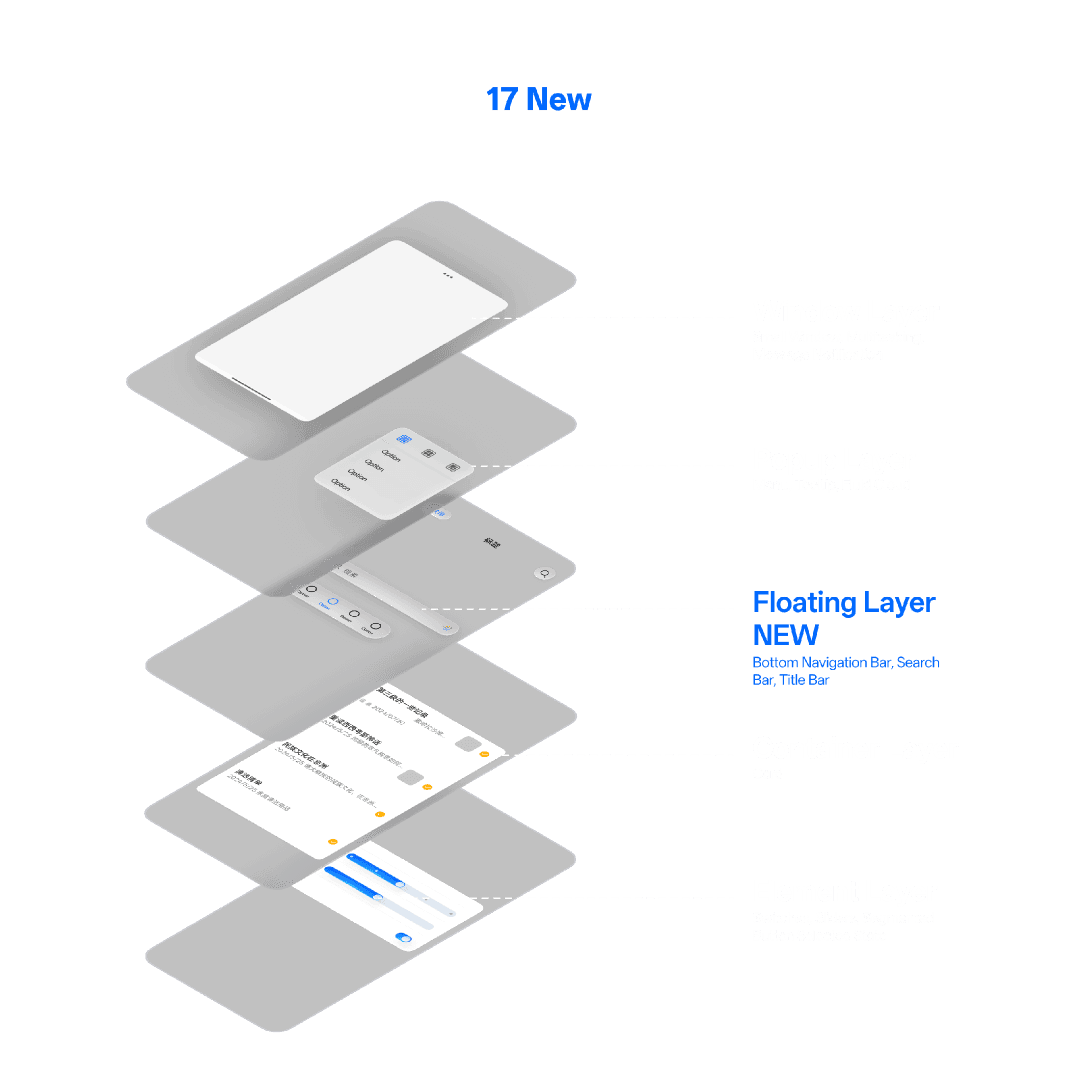
OUTCOME
WHAT WE DO
A new floating layer has been added, and each level has been redefined to ensure that the corresponding content better aligns with the intended design.


OUTCOME
WHAT WE DO
A new floating layer has been added, and each level has been redefined to ensure that the corresponding content better aligns with the intended design.
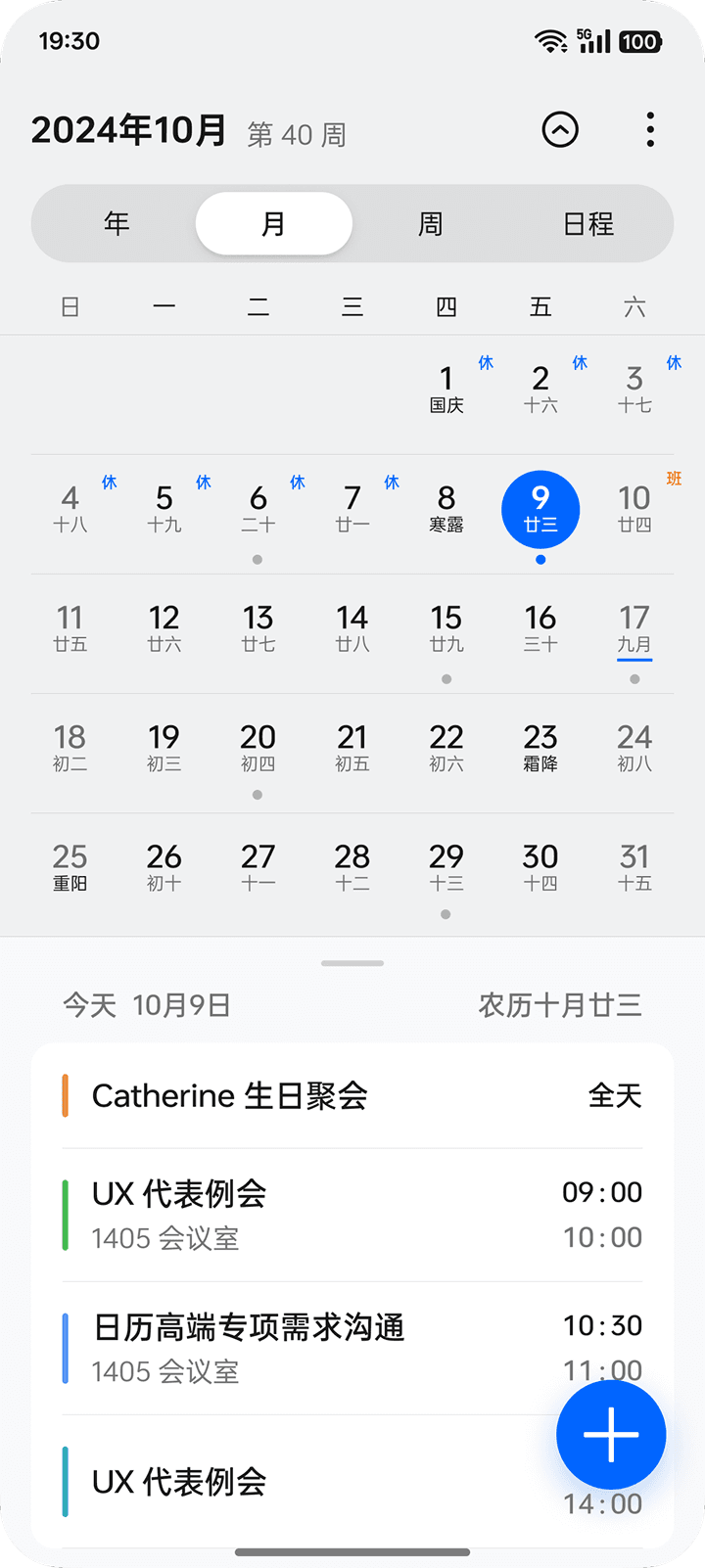
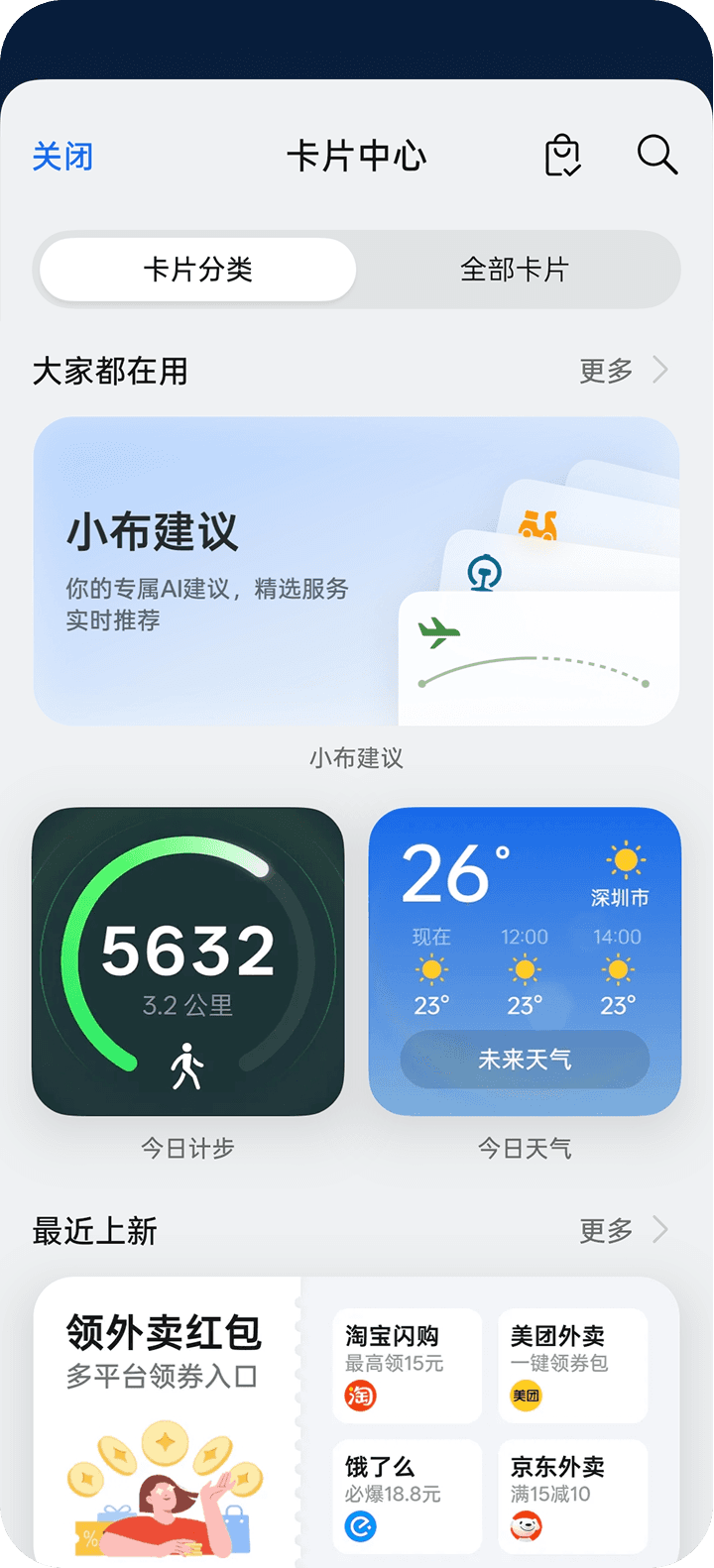
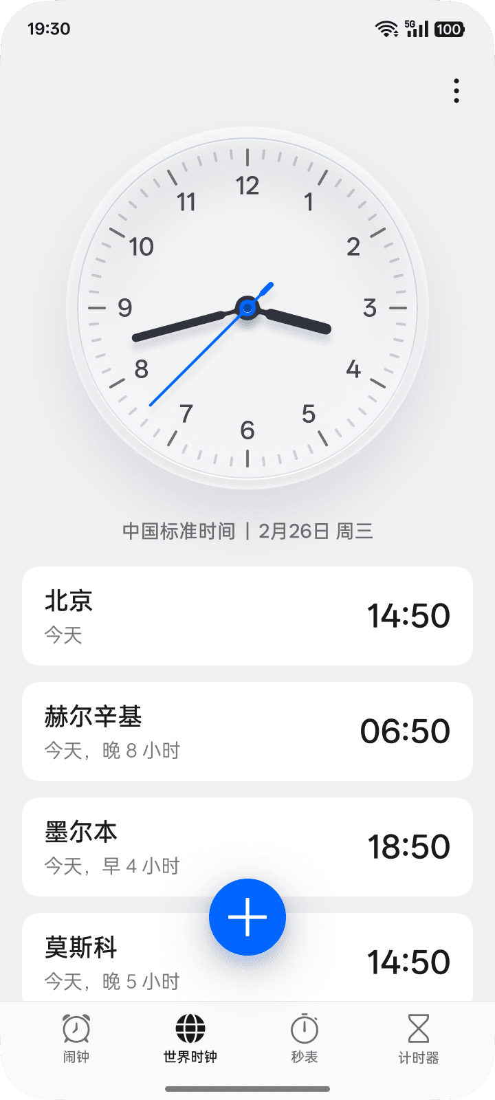
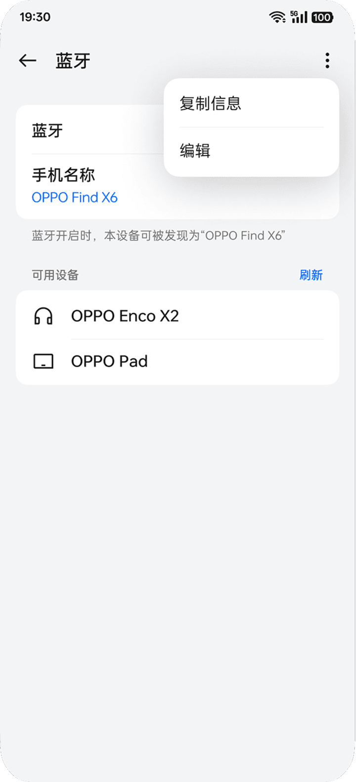
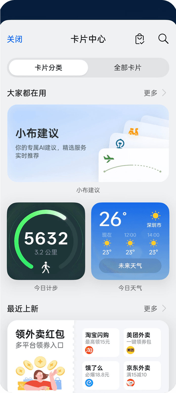
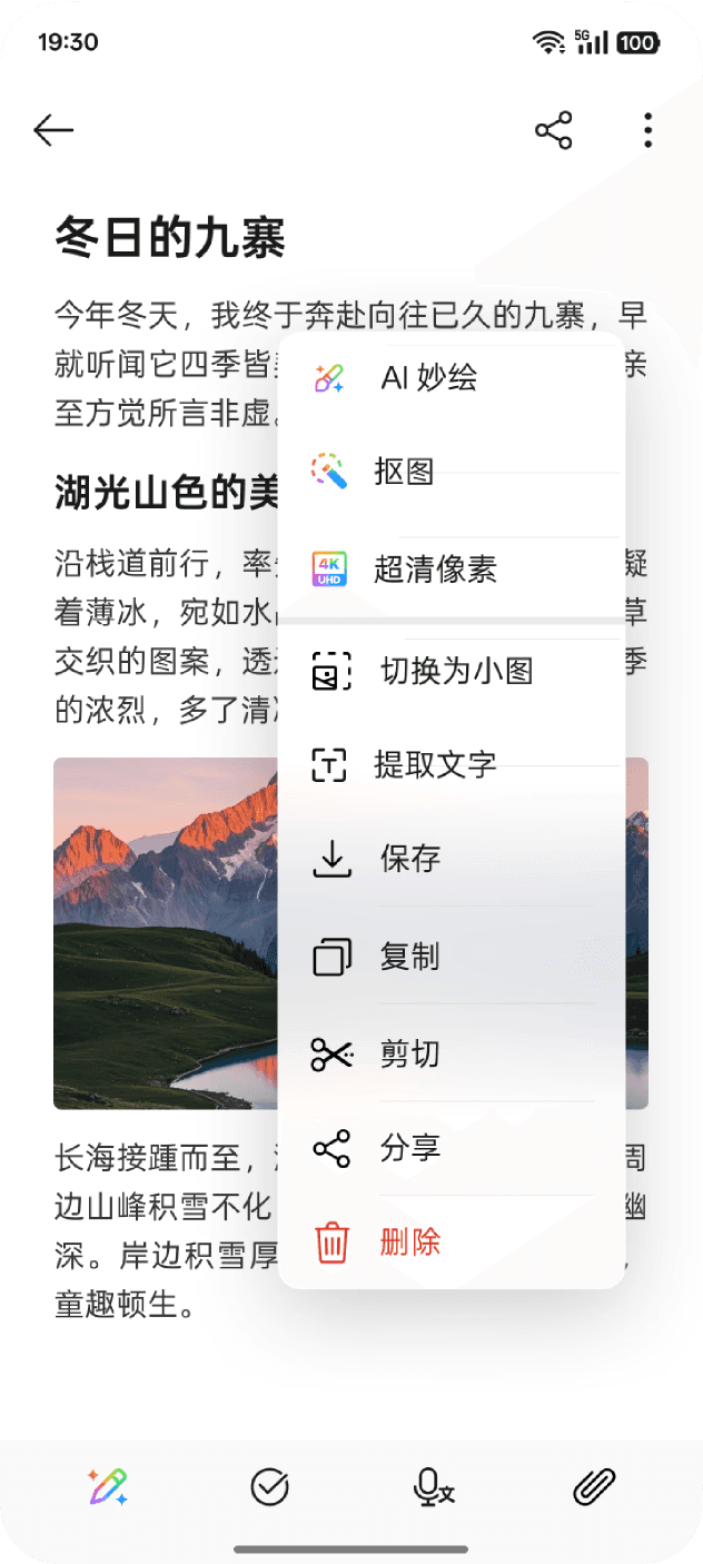
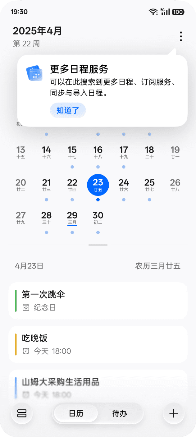
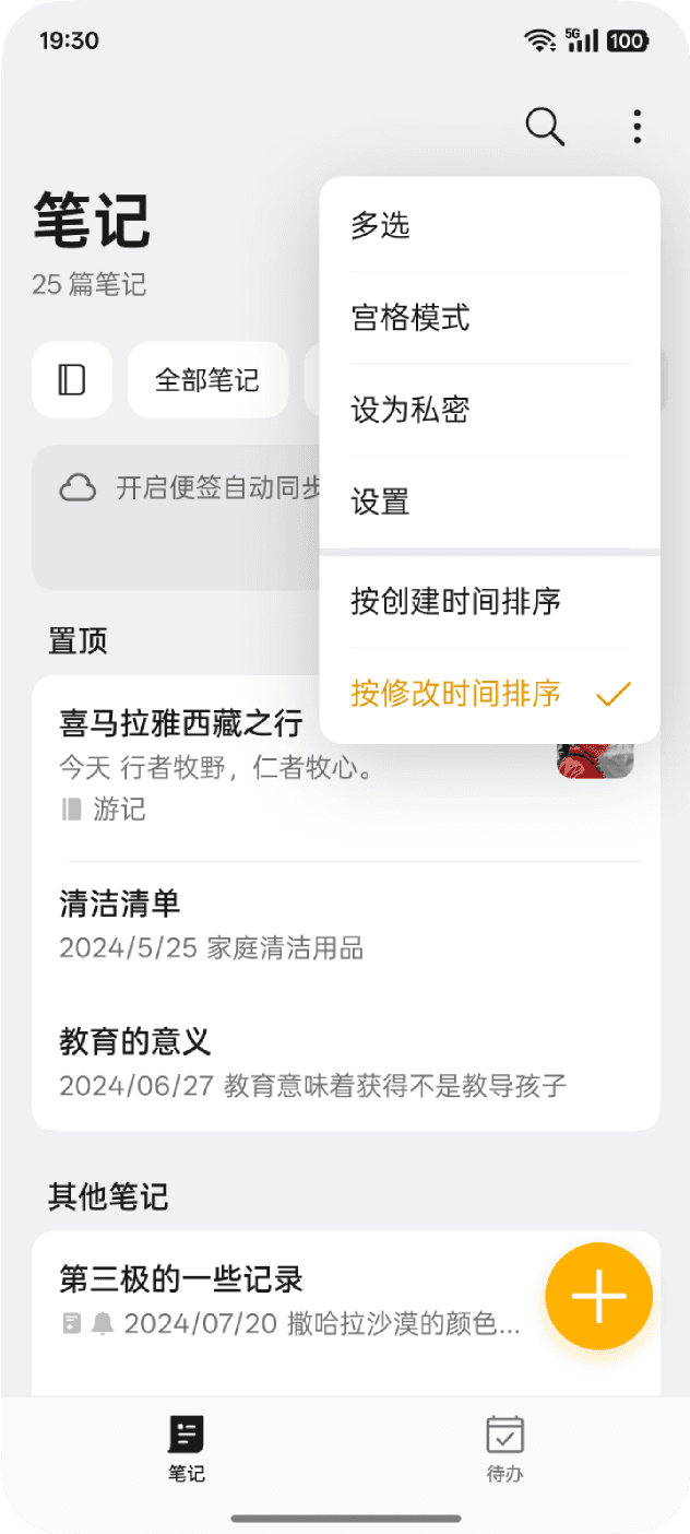
04 DESIGN SHOWCASE
MOCKUPS

04 DESIGN SHOWCASE
MOCKUPS

ColorOS 17
A new system design language
Embedded in OPPO's ColorOS 17 Common Components team, I helped define and ship a translucent, light-driven design language across foundational system components — shaping the visual and interaction foundation for the next major OS release.
ColorOS 17 demanded a new visual paradigm: semi-transparent materials with depth, light physics, and layered elevation — all implementable at OS-level fidelity without sacrificing performance.
From early material exploration through to engineering spec handoff, I owned key components of the system — building frameworks, defining rules, and calibrating rendered builds to achieve pixel-accurate results.
Navigation bars, tab bars, dialogs, title bars, quick actions, system elevation — the full stack of ColorOS 17 core common components.
What I owned
Visual Direction & Material Studies
Early explorations into material behavior and light physics — studying how light-edge strokes, caustic-like bottom highlights, and diffused glow could define a coherent translucent language for the OS.
5-Level Shadow Hierarchy System
Defined and documented a structured 5-tier elevation and shadow system for semi-transparent UI — establishing consistent opacity, blur, stroke, and glow values per tier, enabling systematic application across all components.
Interaction Design & Quick Actions
Redesigned interaction paradigms aligned with the new translucent paradigm — including press-and-hold Quick Action behaviors and comprehensive placement and reachability rules across device form factors.
Engineering Collaboration & Build QA
Partnered with engineers to translate complex rendering effects (light-edge strokes, diffused glow, blur layers, caustic-like bottom light) into precise implementable specs. Calibrated production builds to achieve high-fidelity matches to design intent.
What shipped
A full written + visual specification covering the translucent material grammar — light-edge stroke values, diffused glow parameters, blur radii, and caustic bottom light rules — ready for OS-wide adoption by other component teams.
A structured Figma token set encoding all 5 elevation tiers: named shadow styles, opacity values, blur radii, and stroke weights — directly consumable by designers and referenced in engineering handoff.
Fully annotated Figma files for navigation bars, tab bars, system dialogs, and title bars — covering all states, edge cases, and rendering parameters needed for engineering implementation.
A standalone interaction guideline doc covering trigger thresholds, animation curves, haptic timing, placement grids, and reachability zones — applicable across all ColorOS 17 device form factors.
Side-by-side design-vs-build comparison reports used across multiple QA rounds — documenting delta values and approved calibration targets for light effects implemented in production.
Current problem
The current shadow hierarchy cannot be flexibly applied to all scenarios; in some cases it is difficult to find a shadow hierarchy with a high degree of compatibility, which can easily result in a disjointed appearance.


There is a significant disparity in the visual effects between the different shadow levels, which can create a disjointed experience for users.

The shadow effects on some layers are too heavy and lack sufficient diffusion; combined with the new materials, the texture lacks transparency, resulting in a less visually pleasing appearance.
What we did
A new floating layer has been added, and each level has been redefined to ensure that the corresponding content better aligns with the intended design.
Mockups